How to build a visual identity that stands out in a saturated market
People see more brands in a day than they can count. Logos, ads, and posts blur together. Attention is short. Memory is even shorter. Most names disappear in the noise.
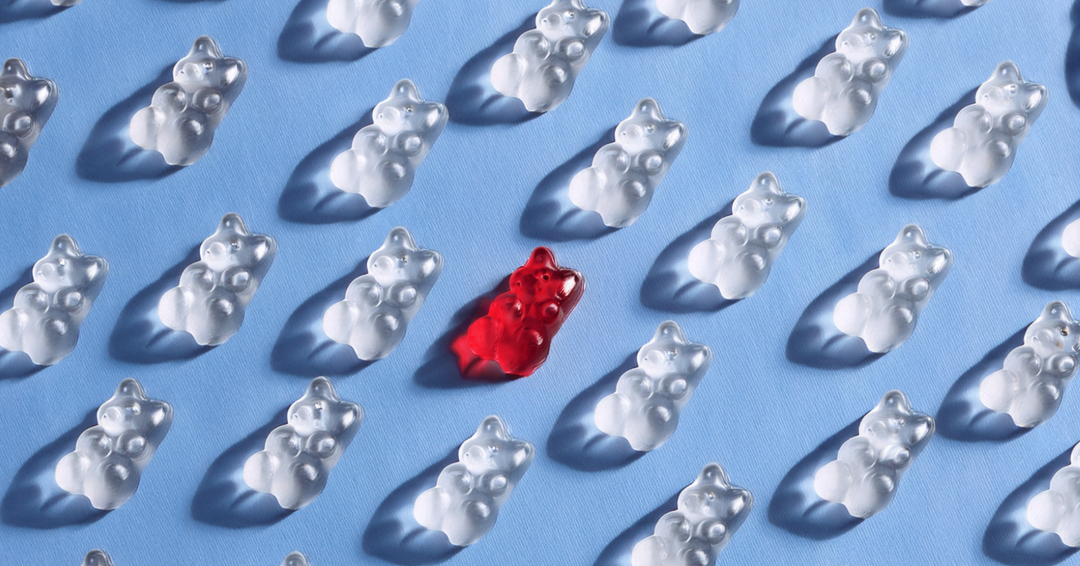
A strong visual identity changes that. It helps a brand get noticed, feel consistent, and earn trust before anyone even reads a word.
Building that kind of identity does not mean following every trend. It means focusing on what makes you distinct and showing up the same way everywhere your audience sees you.
Step 1: Start with your audience and your space
Every great identity starts with understanding who it is for and where it has to stand out. Before diving into design, step back and ask:
Who are we trying to reach, and what draws them in visually?
What brands do they already trust, and what do those brands have in common?
What colors, fonts, or styles dominate our industry right now?
What do we want people to feel when they see us for the first time?
The answers reveal both opportunity and direction. They help you avoid blending in while building something that still feels familiar enough to trust.
Step 2: Lock in your core elements
A strong identity comes from focus. Once you know your audience, define the elements that will anchor everything else.
Logo: Keep it simple and recognizable. It should hold its shape at any size, from a social avatar to a billboard.
Color palette: Choose a handful of colors that reflect your brand’s tone and personality. Limited but distinct always works better than an overcrowded mix.
Typography: Fonts should feel intentional and work together. Consistency matters more than creativity for its own sake.
Imagery: Use visuals that feel real. Avoid generic stock. Focus on style, tone, and content that reflect your brand’s point of view.
With these pieces set, every new asset can build from the same foundation.
Step 3: Stay consistent everywhere
Visual identity only works when it feels unified. Every platform, post, and presentation should carry the same tone and look.
That consistency builds trust. People notice when a brand feels cohesive, even if they cannot explain why.
Clear brand guidelines and a system your team can follow make that possible. When everything aligns, your audience remembers you faster and takes you more seriously.
Step 4: Balance trends with longevity
Trends can help a brand feel modern. They add energy and relevance. But chasing them too closely can backfire. What feels fresh today may feel tired six months from now.
Focus on the fundamentals that last. Clean typography, strong color contrast, and thoughtful layout always hold up. You can add new accents or evolve your image style without losing your core.
When your brand feels current without chasing trends, it stays credible and sharp.
Step 5: Design for adaptability
Your brand has to look right wherever it appears. What works on a homepage should also work in a social post, a print piece, or a product slide.
Adaptable design does not mean changing everything for each format. It means having a flexible system that holds together across platforms.
That kind of consistency builds recognition. When people see your work in different places and it feels familiar every time, it becomes easier to trust.
Common mistakes to avoid
Even strong brands slip up on visual identity. These are some of the most common mistakes to watch for:
Blending in: If your visuals look like everyone else’s, they are easy to forget
Overcomplicating the system: Too many colors, fonts, or graphic styles create noise instead of clarity
Skipping accessibility: Poor contrast, small type, and cluttered layouts limit reach and frustrate users
Ignoring evolution: Visual systems need light updates to stay sharp and relevant. Letting it sit untouched for years dulls impact
How to tell if it is working
Strong visual identity does not just look good. It works.
People recognize you faster. They understand what you offer more clearly. They start to associate your brand with quality and consistency.
It shows up in how they respond. Are they staying on your site longer? Sharing your content? Choosing you over someone else who offers the same thing?
That is the impact of good design. It is not just aesthetic. It builds the foundation for trust and long-term growth.
The impact of getting it right
Visual identity is often the first signal your brand sends. It sets expectations before a word is read. When it is strong and consistent, it builds recognition. And with recognition comes trust.
That trust shows up in how people engage, remember, and choose your brand.
At Kinetic, we help companies create visual systems that perform in the real world